Turtlemint app—finance & insurance management
Fintech - B2C
IA and design system redesign
Research led
App
Role
Lead Designer
Timeline
3 yrs and on going
Team
9 people
Product
Turtlemint- insurances and claims

“I only open the app when renewal is due”
-Arjun
When insurance was just a list
The challenge:
Users treated our app like a digital locker—upload documents, then
disappear
The question:
How do we transform a one-time task into an ongoing relationship?
Low engagement
Insurance
One time action


This redesign transformed our app from insurance-only to a multi-product finance platform, driving a 56% increase in engagement.
How it shaped user journeys
One family,
one unified experience
In most Indian families, one person — often the father — manages everyone’s insurance and finances.
For Arjun, that meant tracking policies for his parents, wife, and kids.
We designed the experience around this shared responsibility, connecting each member’s journey under one view.
"I just want to know everyone’s covered —
without logging into five apps.”
-Arjun

From patterns to personas:
decoding user behavior with AI
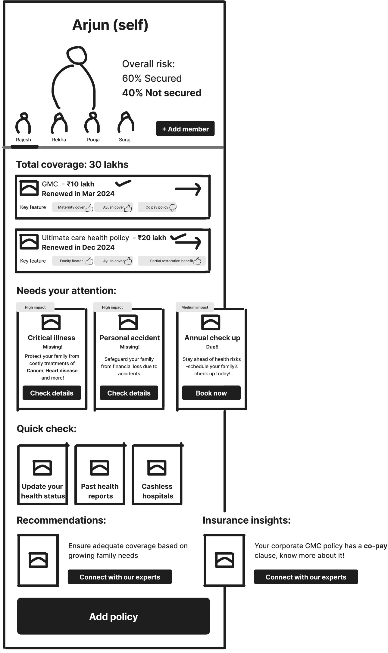
I used AI to aggregate user voices (app reviews, X/Reddit/LinkedIn, surveys) and cluster them by risk exposure across health, vehicle, and life.
For each cluster, I mapped current risks, their impact, and what would help (smart reminders, coverage nudges, education).
These AI personas guided what we built first. Below is Arjun’s synthesis as an example.

AI model used: ChatGPT + Gemini (for clustering + pattern recognition)
Impact
Retention
+25%
From "upload and forget"
to active asset monitoring
Engagement
+56%
Family policy
management feature
MAU
+27%
1.7M → 2.2M
Mutual Funds & Loans journeys launched through same IA
App evolved into a finance platform, not just insurance

Started with a simple redesign
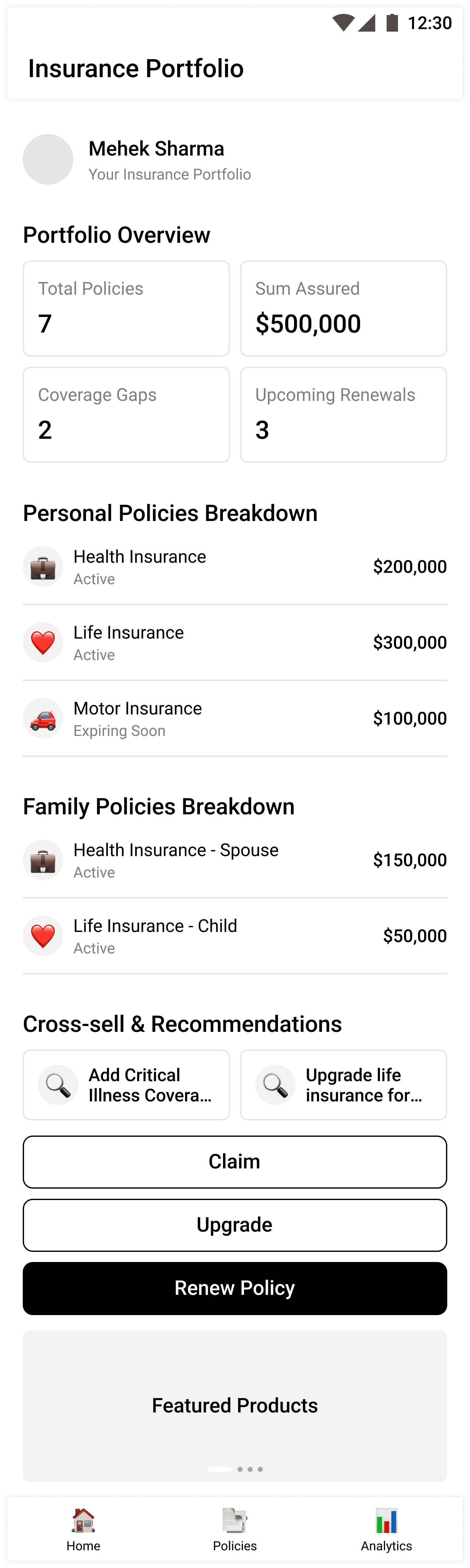
We began by improving the layout and interactions of the insurance screen.
These explorations moved from AI-assisted concepts to hand-drawn wireframes to refined digital layouts, each building on learnings from the last.
AI-generated versions
Refining existing layout


Vertical-based distribution
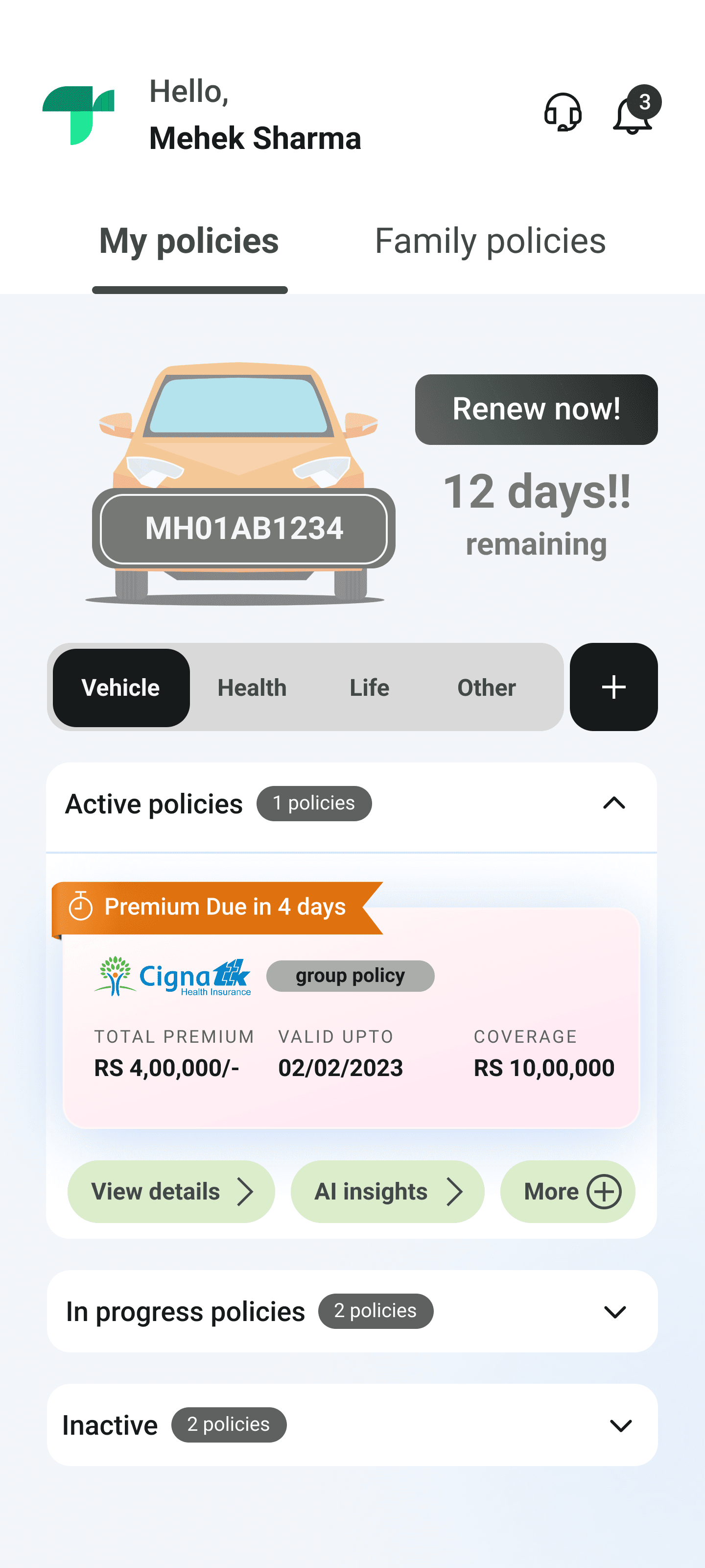
Check out more iterations
Next: Where this led us → Navigation experiments
We iterated again and again—but something still felt off
After the vertical-based layout, we tested new navigations and benchmarked other apps.
The flows improved, but we realised we were still solving the problem at a surface level.
Navigation exploration


Benchmarking other apps


Check out benchmarking
Next: from 'better insurance app' to 'asset management platform'
Going deeper: From surface fixes to system thinking
To move beyond surface-level fixes, we spoke with policyholders and explored real user voices on X, Reddit, and LinkedIn.
Their stories helped us see why people actually buy insurance — to protect what they own, value, or love.

During this phase, our VP of Product said something that completely
reframed our lens: “See insurance through the lens of risk on your assets.”
Research insights
We spoke with 15 policyholders and explored real conversations on X, Reddit, and LinkedIn

From policyholder to asset owner
Arjun
Protect
Insure assets against risks
Grow
Build wealth through simple goals
Borrow
Access credit when needed
Next: translating system thinking into structure → Information Architecture
Zooming in: The asset-first system in action
Building on the Protect–Grow–Borrow framework, we restructured the IA around assets instead of policies.
This shift connected every financial touchpoint—from insurance to investments and credit—
under one unified structure.

The result: a system that scales naturally as new financial products get added.

Asset type
Product category
User flows
See full IA structure
Next: bringing the asset-first IA to life → User journeys & UI design
Bringing the vision to life

Users now see all assets in one place, get proactive alerts,
and can take action without leaving the app.

Beyond the Journey:
Exploring the Verticals
Vehicle, Health, and Life—risk education, clearer policies, simpler claims. Coming soon

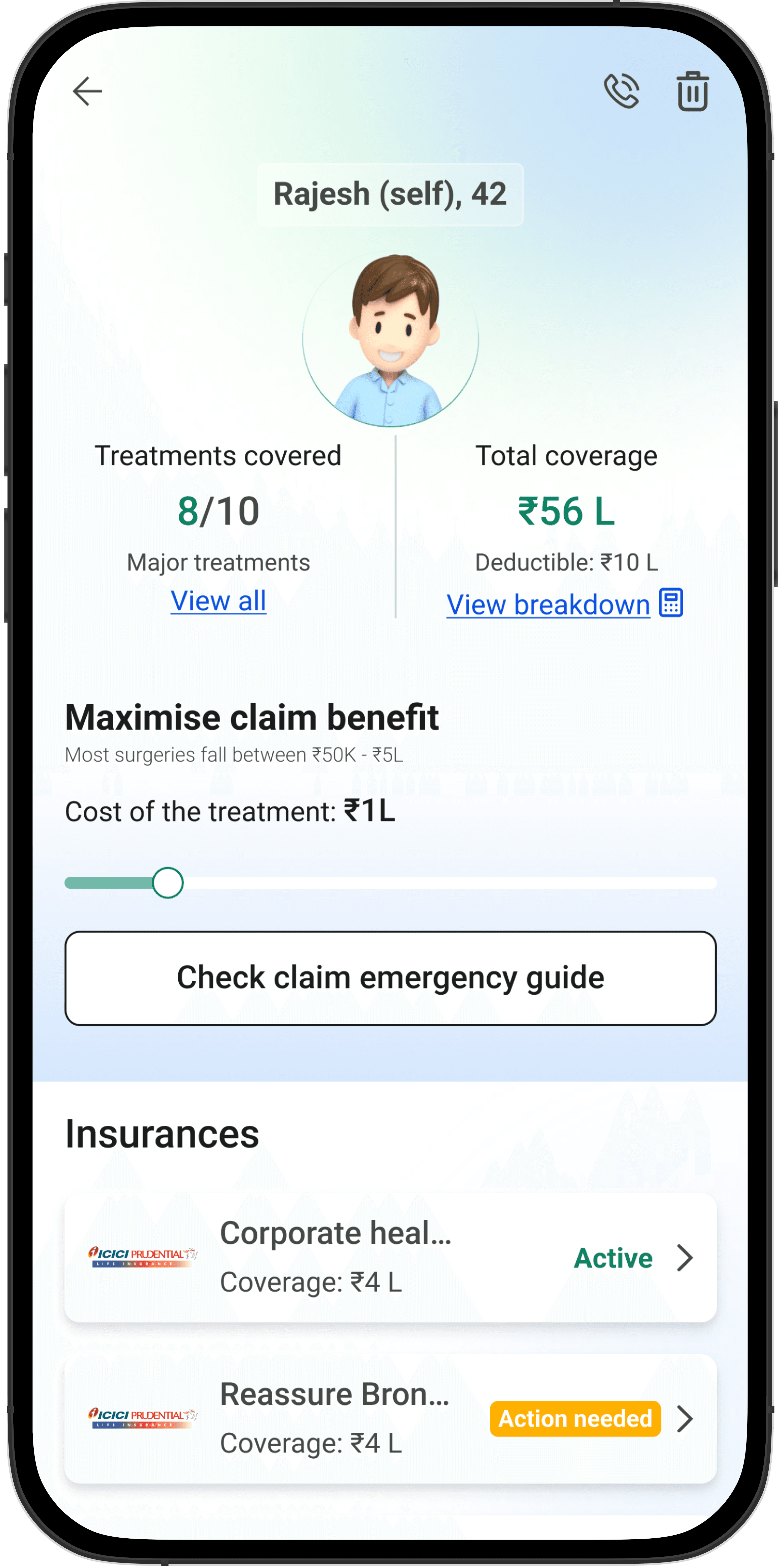

Final solution(s)
Understanding your
policy better
From coverage clarity to claim readiness, every screen helps users see risks, act faster, and feel in control.

Managing what matters, in one place
Each asset now comes alive with context—alerts, renewals, and quick actions built into one view.

Expanding beyond insurance
Mutual Fund and Loan journeys join the platform—built on the same asset-first IA.


Thanks for reading!
My experience:
This project was a long but rewarding ride — full of learnings, experiments, and tiny wins that made big differences.
I learnt to trust the process, ask better questions, and always design for clarity and care.
Thanks for your time! Feel free to reach out if you’d like to chat about this project or design in general :)